You can use columns to arrange content in structured layouts, making your site visually appealing and easy to navigate. In this guide, you’ll learn how to customize design aspects of your columns, like the colors, alignment, and appearance on mobile.
In this guide
Have a question?
Ask our AI assistantTo add or change the background color of columns, take the following steps:
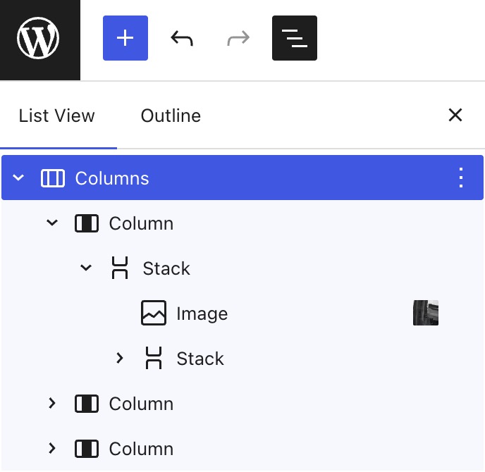
- Select List View in the top-left corner of the editor. It’s the icon that looks like three horizontal lines above each other.
- Locate the Columns block here and click on it:

- In the Columns block settings sidebar on the right side of the screen, click on the Styles tab (the icon looks like a black and white circle):
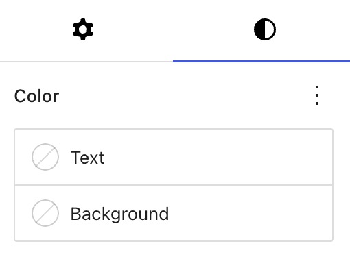
- In the color settings, click on “Background” and select a background color.
- Click the “Save” button to save your changes.
If you want to select different colors for each column, follow the same steps but select an individual Column block in the List View, instead of the overall Columns block.
When you add content to a new column, it will be aligned to the top of the column’s container by default. You can change the alignment of content inside of columns by taking the following steps:
- Select List View in the top-left corner of the editor. It’s the icon that looks like three horizontal lines above each other.
- Locate the Columns block here and click on it:
- In the toolbar that appears above or below the selected columns, click the vertical alignment option:

- Choose from “align top“, “align middle“, or “align bottom” so that all content inside the columns sits at the top, middle, or bottom of the column’s container.
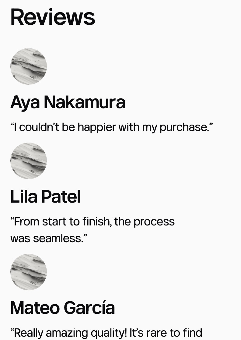
If you want to select different alignments for each column, follow the same steps but select an individual column in the List View, instead of the overall columns. By doing so, you can create a dispersed layout like this:
When using a columns layout, it’s important to consider how your columns will appear for visitors to your website using mobile devices. Phones have smaller screens, so multiple columns may not all fit nicely in a single row while keeping your content legible.
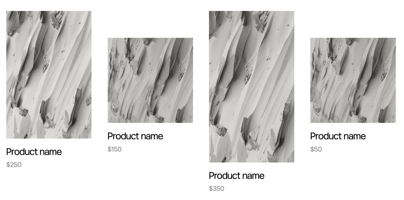
You can choose to “stack” the columns on mobile screens so that they appear one on top of the other, instead of all on one single line:
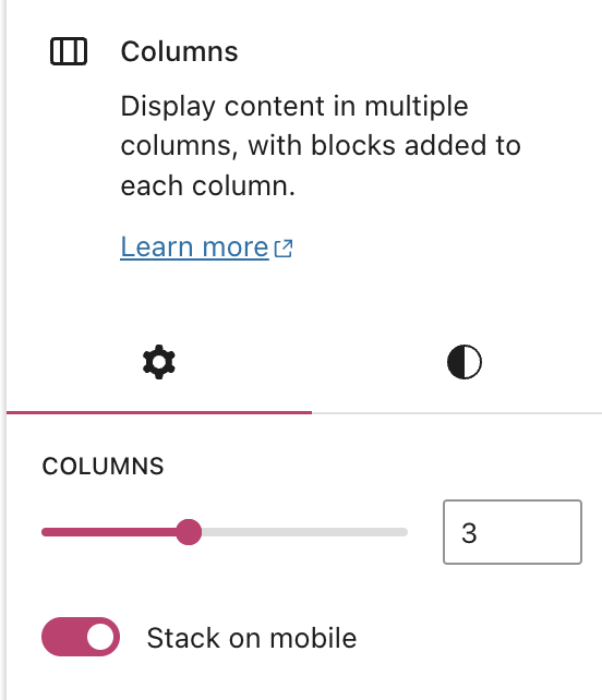
- Select the Columns block, either by using List View or the block toolbar.
- In the Columns block settings sidebar on the right side of the screen, toggle on the “Stack on mobile” switch:
This toggle switch determines if the columns are displayed horizontally or stacked vertically when the page or post is viewed on a mobile device. Here is an example of stacked columns when viewed on desktop/laptop screens compared to a mobile screen: