- All Implemented Interfaces:
LayoutManager,LayoutManager2
public class GroupLayout
extends Object
implements LayoutManager2
GroupLayout is a LayoutManager that hierarchically
groups components in order to position them in a Container.
GroupLayout is intended for use by builders, but may be
hand-coded as well.
Grouping is done by instances of the Group class.
GroupLayout supports two types of groups. A sequential group
positions its child elements sequentially, one after another. A
parallel group aligns its child elements in one of four ways.
Each group may contain any number of elements, where an element is
a Group, Component, or gap. A gap can be thought
of as an invisible component with a minimum, preferred and maximum
size. In addition GroupLayout supports a preferred gap,
whose value comes from LayoutStyle.
Elements are similar to a spring. Each element has a range as
specified by a minimum, preferred and maximum. Gaps have either a
developer-specified range, or a range determined by
LayoutStyle. The range for Components is determined from
the Component's getMinimumSize,
getPreferredSize and getMaximumSize methods. In addition,
when adding Components you may specify a particular range
to use instead of that from the component. The range for a
Group is determined by the type of group. A ParallelGroup's
range is the maximum of the ranges of its elements. A
SequentialGroup's range is the sum of the ranges of its elements.
GroupLayout treats each axis independently. That is, there
is a group representing the horizontal axis, and a group
representing the vertical axis. The horizontal group is
responsible for determining the minimum, preferred and maximum size
along the horizontal axis as well as setting the x and width of the
components contained in it. The vertical group is responsible for
determining the minimum, preferred and maximum size along the
vertical axis as well as setting the y and height of the
components contained in it. Each Component must exist in both
a horizontal and vertical group, otherwise an IllegalStateException
is thrown during layout, or when the minimum, preferred or
maximum size is requested.
The following diagram shows a sequential group along the horizontal axis. The sequential group contains three components. A parallel group was used along the vertical axis.
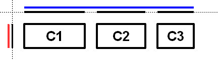
To reinforce that each axis is treated independently the diagram shows the range of each group and element along each axis. The range of each component has been projected onto the axes, and the groups are rendered in blue (horizontal) and red (vertical). For readability there is a gap between each of the elements in the sequential group.
The sequential group along the horizontal axis is rendered as a solid blue line. Notice the sequential group is the sum of the children elements it contains.
Along the vertical axis the parallel group is the maximum of the height of each of the components. As all three components have the same height, the parallel group has the same height.
The following diagram shows the same three components, but with the parallel group along the horizontal axis and the sequential group along the vertical axis.

As c1 is the largest of the three components, the parallel
group is sized to c1. As c2 and c3 are smaller
than c1 they are aligned based on the alignment specified
for the component (if specified) or the default alignment of the
parallel group. In the diagram c2 and c3 were created
with an alignment of LEADING. If the component orientation were
right-to-left then c2 and c3 would be positioned on
the opposite side.
The following diagram shows a sequential group along both the horizontal and vertical axis.

GroupLayout provides the ability to insert gaps between
Components. The size of the gap is determined by an
instance of LayoutStyle. This may be turned on using the
setAutoCreateGaps method. Similarly, you may use
the setAutoCreateContainerGaps method to insert gaps
between components that touch the edge of the parent container and the
container.
The following builds a panel consisting of two labels in one column, followed by two textfields in the next column:
   JComponent panel = ...;
   GroupLayout layout = new GroupLayout(panel);
   panel.setLayout(layout);

   // Turn on automatically adding gaps between components
   layout.setAutoCreateGaps(true);

   // Turn on automatically creating gaps between components that touch
   // the edge of the container and the container.
   layout.setAutoCreateContainerGaps(true);

   // Create a sequential group for the horizontal axis.

   GroupLayout.SequentialGroup hGroup = layout.createSequentialGroup();

   // The sequential group in turn contains two parallel groups.
   // One parallel group contains the labels, the other the text fields.
   // Putting the labels in a parallel group along the horizontal axis
   // positions them at the same x location.
   //
   // Variable indentation is used to reinforce the level of grouping.
   hGroup.addGroup(layout.createParallelGroup().
            addComponent(label1).addComponent(label2));
   hGroup.addGroup(layout.createParallelGroup().
            addComponent(tf1).addComponent(tf2));
   layout.setHorizontalGroup(hGroup);

   // Create a sequential group for the vertical axis.
   GroupLayout.SequentialGroup vGroup = layout.createSequentialGroup();

   // The sequential group contains two parallel groups that align
   // the contents along the baseline. The first parallel group contains
   // the first label and text field, and the second parallel group contains
   // the second label and text field. By using a sequential group
   // the labels and text fields are positioned vertically after one another.
   vGroup.addGroup(layout.createParallelGroup(Alignment.BASELINE).
            addComponent(label1).addComponent(tf1));
   vGroup.addGroup(layout.createParallelGroup(Alignment.BASELINE).
            addComponent(label2).addComponent(tf2));
   layout.setVerticalGroup(vGroup);
When run the following is produced.
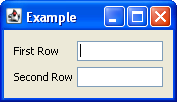
This layout consists of the following.
- The horizontal axis consists of a sequential group containing two parallel groups. The first parallel group contains the labels, and the second parallel group contains the text fields.
- The vertical axis consists of a sequential group containing two parallel groups. The parallel groups are configured to align their components along the baseline. The first parallel group contains the first label and first text field, and the second group consists of the second label and second text field.
- You need not explicitly add the components to the container; this
is indirectly done by using one of the
addmethods ofGroup. - The various
addmethods return the caller. This allows for easy chaining of invocations. For example,group.addComponent(label1).addComponent(label2);is equivalent togroup.addComponent(label1); group.addComponent(label2);. - There are no public constructors for
Groups; instead use the create methods ofGroupLayout.
- Since:
- 1.6
-
Nested Class Summary
Nested Classes Modifier and Type Class Description static classGroupLayout.AlignmentEnumeration of the possible waysParallelGroupcan align its children.classGroupLayout.GroupGroupprovides the basis for the two types of operations supported byGroupLayout: laying out components one after another (SequentialGroup) or aligned (ParallelGroup).classGroupLayout.ParallelGroupAGroupthat aligns and sizes its children.classGroupLayout.SequentialGroupAGroupthat positions and sizes its elements sequentially, one after another. -
Field Summary
Fields Modifier and Type Field Description static intDEFAULT_SIZEIndicates the size from the component or gap should be used for a particular range value.static intPREFERRED_SIZEIndicates the preferred size from the component or gap should be used for a particular range value. -
Constructor Summary
Constructors Constructor Description GroupLayout(Container host)Creates aGroupLayoutfor the specifiedContainer. -
Method Summary
Modifier and Type Method Description voidaddLayoutComponent(Component component, Object constraints)Notification that aComponenthas been added to the parent container.voidaddLayoutComponent(String name, Component component)Notification that aComponenthas been added to the parent container.GroupLayout.ParallelGroupcreateBaselineGroup(boolean resizable, boolean anchorBaselineToTop)Creates and returns aParallelGroupthat aligns its elements along the baseline.GroupLayout.ParallelGroupcreateParallelGroup()Creates and returns aParallelGroupwith an alignment ofAlignment.LEADING.GroupLayout.ParallelGroupcreateParallelGroup(GroupLayout.Alignment alignment)Creates and returns aParallelGroupwith the specified alignment.GroupLayout.ParallelGroupcreateParallelGroup(GroupLayout.Alignment alignment, boolean resizable)Creates and returns aParallelGroupwith the specified alignment and resize behavior.GroupLayout.SequentialGroupcreateSequentialGroup()Creates and returns aSequentialGroup.booleangetAutoCreateContainerGaps()Returnstrueif gaps between the container and components that border the container are automatically created.booleangetAutoCreateGaps()Returnstrueif gaps between components are automatically created.booleangetHonorsVisibility()Returns whether component visibility is considered when sizing and positioning components.floatgetLayoutAlignmentX(Container parent)Returns the alignment along the x axis.floatgetLayoutAlignmentY(Container parent)Returns the alignment along the y axis.LayoutStylegetLayoutStyle()Returns theLayoutStyleused for calculating the preferred gap between components.voidinvalidateLayout(Container parent)Invalidates the layout, indicating that if the layout manager has cached information it should be discarded.voidlayoutContainer(Container parent)Lays out the specified container.voidlinkSize(int axis, Component... components)Forces the specified components to have the same size along the specified axis regardless of their preferred, minimum or maximum sizes.voidlinkSize(Component... components)Forces the specified components to have the same size regardless of their preferred, minimum or maximum sizes.DimensionmaximumLayoutSize(Container parent)Returns the maximum size for the specified container.DimensionminimumLayoutSize(Container parent)Returns the minimum size for the specified container.DimensionpreferredLayoutSize(Container parent)Returns the preferred size for the specified container.voidremoveLayoutComponent(Component component)Notification that aComponenthas been removed from the parent container.voidreplace(Component existingComponent, Component newComponent)Replaces an existing component with a new one.voidsetAutoCreateContainerGaps(boolean autoCreateContainerPadding)Sets whether a gap between the container and components that touch the border of the container should automatically be created.voidsetAutoCreateGaps(boolean autoCreatePadding)Sets whether a gap between components should automatically be created.voidsetHonorsVisibility(boolean honorsVisibility)Sets whether component visibility is considered when sizing and positioning components.voidsetHonorsVisibility(Component component, Boolean honorsVisibility)Sets whether the component's visibility is considered for sizing and positioning.voidsetHorizontalGroup(GroupLayout.Group group)Sets theGroupthat positions and sizes components along the horizontal axis.voidsetLayoutStyle(LayoutStyle layoutStyle)Sets theLayoutStyleused to calculate the preferred gaps between components.voidsetVerticalGroup(GroupLayout.Group group)Sets theGroupthat positions and sizes components along the vertical axis.StringtoString()Returns a string representation of thisGroupLayout.