Multiscale Graph Correlation (MGC)#
With scipy.stats.multiscale_graphcorr, we can test for independence on
high dimensional and nonlinear data. Before we start, let’s import some useful
packages:
>>> import numpy as np
>>> import matplotlib.pyplot as plt; plt.style.use('classic')
>>> from scipy.stats import multiscale_graphcorr
Let’s use a custom plotting function to plot the data relationship:
>>> def mgc_plot(x, y, sim_name, mgc_dict=None, only_viz=False,
...              only_mgc=False):
...     """Plot sim and MGC-plot"""
...     if not only_mgc:
...         # simulation
...         plt.figure(figsize=(8, 8))
...         ax = plt.gca()
...         ax.set_title(sim_name + " Simulation", fontsize=20)
...         ax.scatter(x, y)
...         ax.set_xlabel('X', fontsize=15)
...         ax.set_ylabel('Y', fontsize=15)
...         ax.axis('equal')
...         ax.tick_params(axis="x", labelsize=15)
...         ax.tick_params(axis="y", labelsize=15)
...         plt.show()
...     if not only_viz:
...         # local correlation map
...         plt.figure(figsize=(8,8))
...         ax = plt.gca()
...         mgc_map = mgc_dict["mgc_map"]
...         # draw heatmap
...         ax.set_title("Local Correlation Map", fontsize=20)
...         im = ax.imshow(mgc_map, cmap='YlGnBu')
...         # colorbar
...         cbar = ax.figure.colorbar(im, ax=ax)
...         cbar.ax.set_ylabel("", rotation=-90, va="bottom")
...         ax.invert_yaxis()
...         # Turn spines off and create white grid.
...         for edge, spine in ax.spines.items():
...             spine.set_visible(False)
...         # optimal scale
...         opt_scale = mgc_dict["opt_scale"]
...         ax.scatter(opt_scale[0], opt_scale[1],
...                    marker='X', s=200, color='red')
...         # other formatting
...         ax.tick_params(bottom="off", left="off")
...         ax.set_xlabel('#Neighbors for X', fontsize=15)
...         ax.set_ylabel('#Neighbors for Y', fontsize=15)
...         ax.tick_params(axis="x", labelsize=15)
...         ax.tick_params(axis="y", labelsize=15)
...         ax.set_xlim(0, 100)
...         ax.set_ylim(0, 100)
...         plt.show()
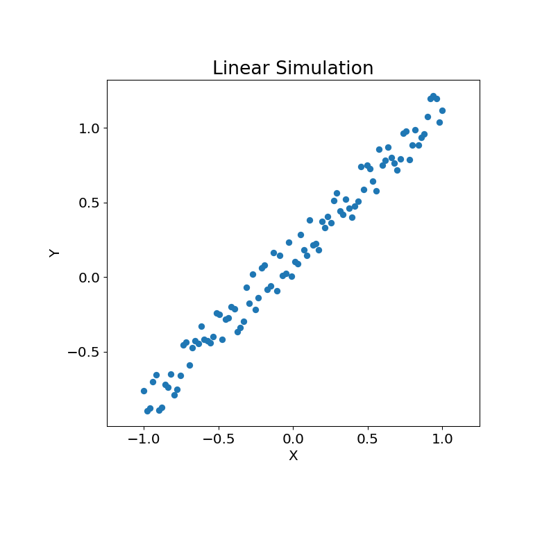
Let’s look at some linear data first:
>>> rng = np.random.default_rng()
>>> x = np.linspace(-1, 1, num=100)
>>> y = x + 0.3 * rng.random(x.size)
The simulation relationship can be plotted below:
>>> mgc_plot(x, y, "Linear", only_viz=True)
Now, we can see the test statistic, p-value, and MGC map visualized below. The optimal scale is shown on the map as a red “x”:
>>> stat, pvalue, mgc_dict = multiscale_graphcorr(x, y)
>>> print("MGC test statistic: ", round(stat, 1))
MGC test statistic:  1.0
>>> print("P-value: ", round(pvalue, 1))
P-value:  0.0
>>> mgc_plot(x, y, "Linear", mgc_dict, only_mgc=True)
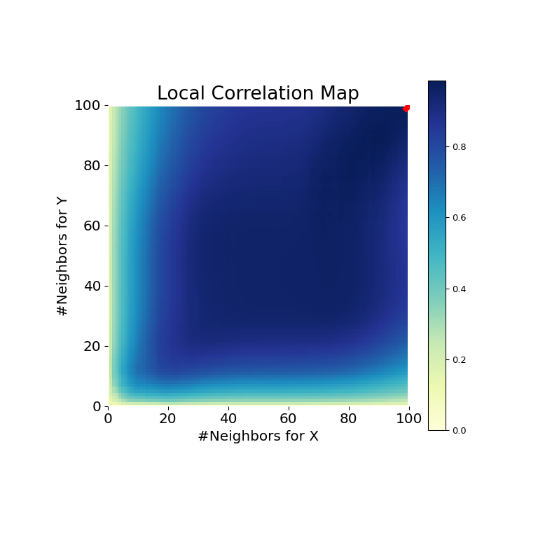
It is clear from here, that MGC is able to determine a relationship between the input data matrices because the p-value is very low and the MGC test statistic is relatively high. The MGC-map indicates a strongly linear relationship. Intuitively, this is because having more neighbors will help in identifying a linear relationship between \(x\) and \(y\). The optimal scale in this case is equivalent to the global scale, marked by a red spot on the map.
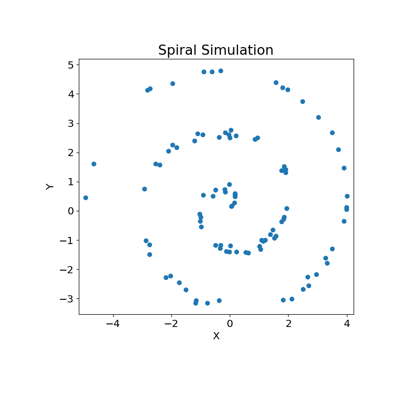
The same can be done for nonlinear data sets. The following \(x\) and \(y\) arrays are derived from a nonlinear simulation:
>>> unif = np.array(rng.uniform(0, 5, size=100))
>>> x = unif * np.cos(np.pi * unif)
>>> y = unif * np.sin(np.pi * unif) + 0.4 * rng.random(x.size)
The simulation relationship can be plotted below:
>>> mgc_plot(x, y, "Spiral", only_viz=True)
Now, we can see the test statistic, p-value, and MGC map visualized below. The optimal scale is shown on the map as a red “x”:
>>> stat, pvalue, mgc_dict = multiscale_graphcorr(x, y)
>>> print("MGC test statistic: ", round(stat, 1))
MGC test statistic:  0.2  # random
>>> print("P-value: ", round(pvalue, 1))
P-value:  0.0
>>> mgc_plot(x, y, "Spiral", mgc_dict, only_mgc=True)
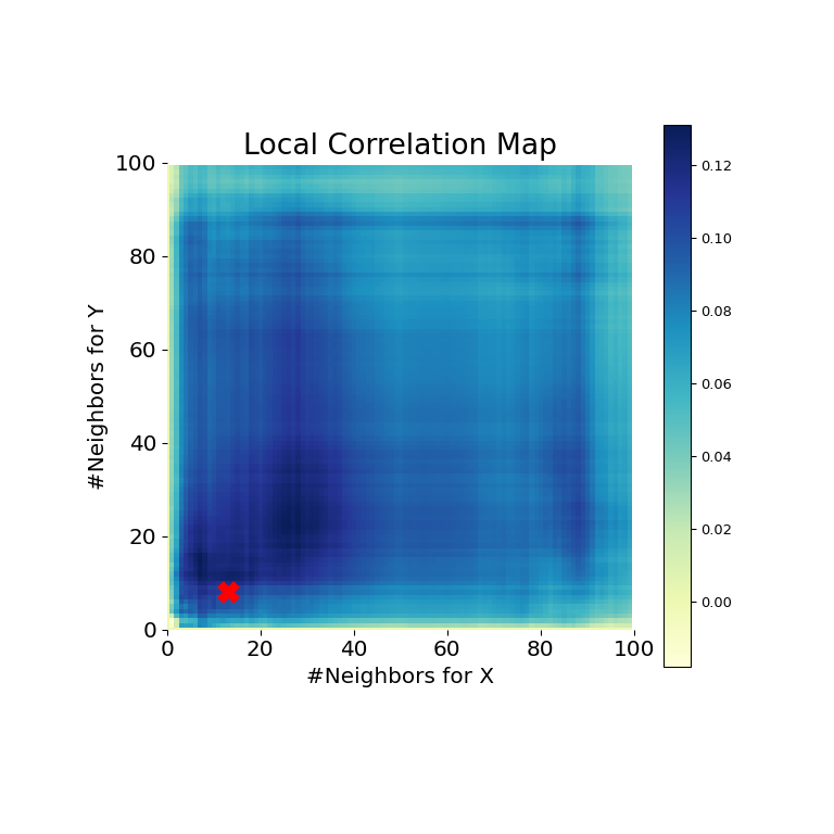
It is clear from here, that MGC is able to determine a relationship again because the p-value is very low and the MGC test statistic is relatively high. The MGC-map indicates a strongly nonlinear relationship. The optimal scale in this case is equivalent to the local scale, marked by a red spot on the map.